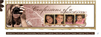
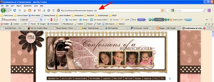
Here is a fairly easy tutorial for installing a drop down navigation bar into your Blogger Blog. (Like the dark brown one in my header section)
STEP 1: In Blogger, go to your “Layout” and “Page Elements” section.
- Click on the “Add a Gadget” link just under your header image: (Note: If you are just starting your blog, the “Minima Lefty” template is a good one to start with. It’s simple and you can customize it as you go.)
- From the Gadget’s List, select “HTML/Javascript” option.
STEP 2: Simply copy and paste this ENTIRE code into your widget. Note: Leave the “Title” section of this widget blank.
<style type=”text/css”>
/* style the outer div to give it width */
.menu {
width:1000px;
font-size:14px;
padding-bottom:40px;
}
/* remove all the bullets, borders and padding from the default list styling */
.menu ul {
padding:0;
margin:0;
list-style-type:none;
font: 14px Tahoma, Arial;
}
.menu ul ul {
/* width:124px; */
border:1px solid #fff;
border-width:0px 0px 1px 0px;
}
/* float the list to make it horizontal and a relative positon so that you can control the dropdown menu positon */
.menu li {
float:left;
width:125px;
position:relative;
border-width:0px 0px 1px 0px;
}
/* style the links for the top level */
.menu a, .menu a:visited {
display:block;
font-size:14px;
color: #ffffff;
text-decoration:none;
width:125px;
height:30px;
border:1px solid #fff;
border-width:0px 0px 0px 0;
background-color: #45240e; /*DkBrown*/
padding-left:1px;
line-height:29px;
}
/* a hack so that IE5.5 faulty box model is corrected */
* html .menu a, * html .menu a:visited {
width:125px;
w\idth:125px;
}
/* style the second level background */
.menu ul ul a.drop, .menu ul ul a.drop:visited {
background: #fecebe; /*LIGHT-PINK*/
border:1px solid #fff;
border-width:0px 0px 1px 0px;
color: #45240e;
}
/* style the second level hover */
.menu ul ul a.drop:hover{
background:#e36c6c; /*DK-PINK*/
border:1px solid #fff;
border-width:0px 0px 1px 0px;
color:#ffffff;
}
.menu ul ul :hover > a.drop {
background: #fecebe; /*LIGHT-PINK*/
border:1px solid #fff;
border-width:0px 0px 1px 0px;
color:#45240e; /*DkBrown*/
}
/* style the third level background */
.menu ul ul ul a, .menu ul ul ul a:visited {
background: #fecebe; /*LIGHT-PINK*/
color:#45240e; /*DkBrown*/
border:1px solid #fff;
border-width:0px 0px 1px 0px;
}
/* style the third level hover */
.menu ul ul ul a:hover {
background:#e36c6c; /*DK-PINK*/
border:1px solid #fff;
border-width:0px 0px 1px 0px;
}
.menu ul ul ul :hover > a {
background:#e36c6c; /*DK-PINK*/
border:1px solid #fff;
border-width:0px 0px 1px 0px;
}
/* hide the sub levels and give them a positon absolute so that they take up no room */
.menu ul ul {
visibility:hidden;
position:absolute;
height:0;
top:31px;
left:0;
width:125px;
}
/* another hack for IE5.5 */
* html .menu ul ul {
top:30px;
t\op:31px;
}
/* position the third level flyout menu */
.menu ul ul ul{
left:126px;
top:0;
width:125px;
}
/* position the third level flyout menu for a left flyout */
.menu ul ul ul.left {
left:-150px;
}
/* style the table so that it takes no part in the layout – required for IE to work */
.menu table {position:absolute; top:0; left:0;}
/* style the second level links */
.menu ul ul a, .menu ul ul a:visited {
background: #fecebe; /*LIGHT-PINK*/
color:#45240e; /*Dk-BROWN*/
height:auto;
line-height:1em;
padding:5px 0px;
width:125px;
border:1px solid #fff;
border-width:0px 0px 1px 0px;
/* yet another hack for IE5.5 */
}
* html .menu ul ul a{
width:124px;
w\idth:124px;
}
/* style the top level hover */
.menu a:hover, .menu ul ul a:hover{
color:#ffffff;
background:#e36c6c; /*DK-PINK*/
border:1px solid #fff;
border-width:0px 0px 1px 0px;
}
.menu :hover > a, .menu ul ul :hover > a {
color:#ffffff;
background:#e36c6c; /*DK-PINK*/
border:1px solid #fff;
border-width:0px 0px 1px 0px;
}
/* make the second level visible when hover on first level list OR link */
.menu ul :hover ul {
visibility:visible;
}
/* keep the third level hidden when you hover on first level list OR link */
.menu ul :hover ul ul{
visibility:hidden;
}
/* keep the fourth level hidden when you hover on second level list OR link */
.menu ul :hover ul :hover ul ul{
visibility:hidden;
}
/* keep the fourth level hidden when you hover on second level list OR link */
.menu ul :hover ul :hover ul :hover ul ul{
visibility:hidden;
}
/* make the third level visible when you hover over second level list OR link */
.menu ul :hover ul :hover ul{
visibility:visible;
}
/* make the fourth level visible when you hover over third level list OR link */
.menu ul :hover ul :hover ul :hover ul {
visibility:visible;
}
/* make the fourth level visible when you hover over third level list OR link */
.menu ul :hover ul :hover ul :hover ul :hover ul {
visibility:visible;
}
</style>
<div>
<ul>
<li><a style=”color: #ffffff;” href=”http://YOUR URL HERE.com”>Tab 1 Title Here</a>
<ul>
<li><a href=”http://YOUR URL HERE.com”>Sub Tab 1.A</a></li><li><a href=”http://YOUR URL HERE.com”>Sub Tab 1.B</a></li>
<li><a href=”http://YOUR URL HERE.com”>Sub Tab 1.C</a></li>
</ul>
</li><li><a style=”color: #ffffff;” href=”http://YOUR URL HERE.com”>Tab 2 Title Here</a>
<ul>
<li><a href=”http://YOUR URL HERE.com”>Sub Tab 2.A</a></li><li><a href=”http://YOUR URL HERE.com”>Sub Tab 2.B</a></li>
<li><a href=”http://YOUR URL HERE.com”>Sub Tab 2.C</a></li>
</ul>
</li><li><a style=”color: #ffffff;” href=”http://YOUR URL HERE.com”>Tab 3 Title Here</a>
<ul>
<li><a href=”http://YOUR URL HERE.com”>Sub Tab 3.A</a></li><li><a href=”http://YOUR URL HERE.com”>Sub Tab 3.B</a></li>
<li><a href=”http://YOUR URL HERE.com”>Sub Tab 3.C</a></li>
</ul>
</li>
</ul>
</div>
STEP 3: Customize your main tabs by changing the Tab Titles to whatever you want. Include a URL for each one if you want it to be ‘clickable’. If not, you can just put a # sign where it says http://URL HERE.
- You can add or delete as many of the MAIN tabs as you need, just make sure to copy the entire code for the main tab for each additional tab you want:
<li><a href=”http://YOUR URL HERE.com”>Tab 3 Title Here</a>
<ul><li><a href=”http://YOUR URL HERE.com”>Sub Tab 3.A</a></li><li><a href=”http://YOUR URL HERE.com”>Sub Tab 3.B</a></li>
<li><a href=”http://YOUR URL HERE.com”>Sub Tab 3.C</a></li>
</ul></li>
- You can adjust the length of your buttons by adjusting padding as seen in red below. The padding pixels are read as follows: top, right, bottom, left.
#navbar li a {
display: block;
padding: 4px 9px 4px 9px;
background-color: #43291a; /*TAN936f47*/
text-decoration: none;
border-right: 1px solid white;
color: #EAFFED; }
- You can also change the margins to move the navbar as seen in red below. The last number in the margin is the LEFT margin. The margin pixels are read as follows: top, right, bottom, left. A negative number will move your item to the left, a positive number will move it to the right:
#navbar {
background-position: center;
margin:5px 5px 5px 300px;
padding: 0;
width:1000px; }
STEP 4: Customize your sub tabs by changing the Green Titlesto whatever you want. Include the URL for each one as well if you want it to be ‘clickable’.
- You can add or delete as many tabs as you need, just make sure to copy the entire code for the Sub-tabs section:
<li><a href=”http://YOUR URL HERE.com”>Sub Tab 3.A</a></li>
STEP 5: Customize the colors of your tabs to match your site. Here are some online color sites to help you out! I also commented my colors to help guide you.
BUTTON: To Change the background color of your buttons find the ‘background-color’ section of the code
FONT: To Change the font color find the ‘color’ section both are highlighted in the code below. You can change the colors of each section if you like, or use the same colors for each section. Just mess around with it and have fun! If you don’t know HTML well, you may have to experiment with changing colors until you get the right one. The code below is just an example of one of the sections:
#navbar li a {
display: block;
padding: 4px 9px;
background-color: #43291a; /*Dk Brown Tab Background*/
text-decoration: none;
border-right: 1px solid white;
color: #EAFFED; }
- Color Schemer with color codes to help you out!
- Online Web Color Chart
STEP 6: Add your URLs : To get the url code for your tabs, visit the page you want, then simply copy and paste the URL from the Address Bar in your browser. You can also ‘search’ your blog and use that url as well to include several posts. It will look something like this:
/blog/category/homeschool/lapbooks
STEP 7: Give yourself a big bloggy High Five for being AWESOME!
TROUBLE SHOOTING: If your navigation bar shows up BEHIND your posts so you can’t click on the drop down lists, visit Mama Jenn’s Blog for a Fix!
Happy Blogging!


I think I love you… 🙂
Hey, thanks for this post. Clean and easy. I googled a bit on the subject and pretty much all I found was code that involved editing the html on the template.I have one problem though, the same as Jackie above:The dropdown menu appears behind the post and when try to hover a submenu, the dropdown closes.Do you recon it has anything to do with the bottom margin of this bar? Because it seems to be working for everybody else.I'll be waiting for a solution. These dropdowns are crutial to my blog ;)I'm using the 'Picture Window' template, btwThanks
I also tried to create a code for a sub-sub-tab (something like 1.A.1) but it does not seem to be possible. Do you have or know of any way to do this?
You are my new favorite blogger!!! I have been looking and looking for something like this and you have it!!! Once I get mine up and running, I am going to add a post linking back on to how exactly I did this. I have faith that it works and it looks so simple!!! I am going to add your button to my right sidebar. I can't thank you enough… I am just so excited! And giddy!Kristen Alltheproofineed.blogspot.com
I am so sorry I have so many comments! I was just wondering how you were able to delete the "Showing newest posts with label meme. Show older posts" line that happens when you click on a label. I noticed that your nav bar is full of sorted labels and yours doesn't show up. On mine, it wont let me click below that nav bar once the drop down goes that far down. Is there any way to fix that? I noticed other people have the same problem too.I am so grateful for all of your help!Kristenalltheproofineed.blogspot.com
Well…this has been asked before, I can see that…but i did not see a response.My navbar is floating to the right and i would like to have it centered…Now…It works on an old blog I'm testing it on…copied and pasted to a new blog and it totally fails…is different code required for the newer blog…built 2 days ago.Works: http://christophphotography.blogspot.com Does not work: http://christoph-theartofseeing.blogspot.com Thank you so much…Christoph
Christoph: You should be able to say where to float the navbar here where it says float:left by changing it to center#navbar li {list-style: none;float: left;If that doesn't work you can always mess with the margin to scoot it manually like this:margin: 0 0 0 -70pxthe -70px will move the bar to the left, positive pixels will move it to the right. You can also adjust the width of the buttons by increasing or decreasing the padding values:padding: 0 10px 0 10pxSo this section would look like this:#navbar {background-position: center;margin:0 0 0 -70px;padding: 0 10px 0 10px;width:880px; } I think that the new blogger draft mode has messed with this code a bit but with some of these work arounds you should be able to fix it.
Thanks Confessions…I'll try your padding idea and let everyone know.
This is a real blessing. Thank you very much! Mine don't look as nice as yours but they are there and I love them.Blessinsg,Debbie
I just wanted to let others know that I figured out how to make all of the drop down links to be the same size like yours. I've been looking for it for a long time and all it took was a little line. I just added width underneath this section of your code. I hope if anyone was looking for this, they find this helpful!#navbar li ul {width: 125px;margin; 0;padding: 0;display: none;background-color: #fff; /*LIGHT-PINK*/}