Good morning readers! You may have noticed a slight…okay drastic…change over here at the Confessions website! I don’t know about you, but I always get a hankering for some good old fashioned spring cleaning this time of year. And my blog is no different!
I’ve been wanting to update it for a while now, but with the blog, store, and new community it’s a little more complicated to make everything look seamless. So I had to wait on the help of my husband. Who by the way has been working his little tail off for me lately! With the new community, book release, blog updates, and some other surprises we have coming your way he’s been swamped.
But being the awesome guy he is, he carved out some time to help me put up a new fresh look for my blog, and I love it! I wanted it to go along with my homeschooling 101 book cover because I thought it was so fresh and clean looking, so that’s what we did!
So without further ado, let me introduce to you the new and improved Confessions of a Homeschooler!
The navigation and layout is the same, so hopefully you won’t have any issues getting around the sites. We just updated colors, and overall look and feel type stuff.
Depending on your browser you might have to refresh your cache to see all of the updates. So if you’re still seeing pink/green things popping up, just do a simple ‘shift’ + Refresh and you should get all of the new goodies to appear on your page!
Of course I didn’t want to leave my store out of the fun. So it got an update too. This was probably the hardest one to do because there were a ton of custom buttons on it that I had to remake. And for some reason this one seems to not want to refresh with the new images. So if you’re having troubles, or have a mixed view of old and new, just refresh your browser screen and you should be good!
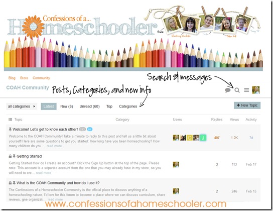
The community got an update too, but all of the buttons and layout are the same. As always you can check your messages, and search for anything using the buttons on the top right (see below). You can also check all of the new posts, categories, top posts, and any unread posts in the feed area as well (see below).
And I just wanted to say a quick “WOW! Thank You!!” to all of you who have participated in the COAH Community! You guys are so awesome, and I’m absolutely honored to read through the posts. I love how encouraging and helpful you all are, and enjoy reading all of the new posts, and comments.
Thank you so much for all of your participation, and I hope you’re enjoying it as much as I am!
I hope you all like the new look, and now I’m off to do the same thing to my house! I don’t know why, but spring time just makes me want to clear out the winter clutter and start fresh!
Watch out kids , mom is on a roll, and I’m heading your way!


I absolutely LOVE the new blog look!!!
Looks wonderful! Simply pressing the F5 key will also update/refresh your screen!
Thanks for the tip! 🙂
Love this! There isn’t much better than freshly sharpened colored pencils. I have been using images of them for my blog too:-)
Congrats on the book!
Nice look! I like the change! Though I do have to say that the lighter blue words are a tiny bit hard to see! Though I love the color!
I love all of your graphics! Isn’t Spring Cleaning wonderful? Especially when it’s over!
what about updated pics of you and the kids? and i remember you saying some kickname changes were in the works too..wink!
i meant to type nick name!
You’re spring cleaning inspired my own spring cleaning! I did my own updates on my website as well: thetr3asures.weebly.com. Thanks for the inspiration.
Congrats! It looks really nice! Greets!