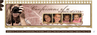
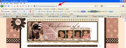
Here is a fairly easy tutorial for installing a drop down navigation bar into your Blogger Blog. (Like the dark brown one in my header section)
STEP 1: In Blogger, go to your “Layout” and “Page Elements” section.
- Click on the “Add a Gadget” link just under your header image: (Note: If you are just starting your blog, the “Minima Lefty” template is a good one to start with. It’s simple and you can customize it as you go.)
- From the Gadget’s List, select “HTML/Javascript” option.
STEP 2: Simply copy and paste this ENTIRE code into your widget. Note: Leave the “Title” section of this widget blank.
<style type=”text/css”>
/* style the outer div to give it width */
.menu {
width:1000px;
font-size:14px;
padding-bottom:40px;
}
/* remove all the bullets, borders and padding from the default list styling */
.menu ul {
padding:0;
margin:0;
list-style-type:none;
font: 14px Tahoma, Arial;
}
.menu ul ul {
/* width:124px; */
border:1px solid #fff;
border-width:0px 0px 1px 0px;
}
/* float the list to make it horizontal and a relative positon so that you can control the dropdown menu positon */
.menu li {
float:left;
width:125px;
position:relative;
border-width:0px 0px 1px 0px;
}
/* style the links for the top level */
.menu a, .menu a:visited {
display:block;
font-size:14px;
color: #ffffff;
text-decoration:none;
width:125px;
height:30px;
border:1px solid #fff;
border-width:0px 0px 0px 0;
background-color: #45240e; /*DkBrown*/
padding-left:1px;
line-height:29px;
}
/* a hack so that IE5.5 faulty box model is corrected */
* html .menu a, * html .menu a:visited {
width:125px;
w\idth:125px;
}
/* style the second level background */
.menu ul ul a.drop, .menu ul ul a.drop:visited {
background: #fecebe; /*LIGHT-PINK*/
border:1px solid #fff;
border-width:0px 0px 1px 0px;
color: #45240e;
}
/* style the second level hover */
.menu ul ul a.drop:hover{
background:#e36c6c; /*DK-PINK*/
border:1px solid #fff;
border-width:0px 0px 1px 0px;
color:#ffffff;
}
.menu ul ul :hover > a.drop {
background: #fecebe; /*LIGHT-PINK*/
border:1px solid #fff;
border-width:0px 0px 1px 0px;
color:#45240e; /*DkBrown*/
}
/* style the third level background */
.menu ul ul ul a, .menu ul ul ul a:visited {
background: #fecebe; /*LIGHT-PINK*/
color:#45240e; /*DkBrown*/
border:1px solid #fff;
border-width:0px 0px 1px 0px;
}
/* style the third level hover */
.menu ul ul ul a:hover {
background:#e36c6c; /*DK-PINK*/
border:1px solid #fff;
border-width:0px 0px 1px 0px;
}
.menu ul ul ul :hover > a {
background:#e36c6c; /*DK-PINK*/
border:1px solid #fff;
border-width:0px 0px 1px 0px;
}
/* hide the sub levels and give them a positon absolute so that they take up no room */
.menu ul ul {
visibility:hidden;
position:absolute;
height:0;
top:31px;
left:0;
width:125px;
}
/* another hack for IE5.5 */
* html .menu ul ul {
top:30px;
t\op:31px;
}
/* position the third level flyout menu */
.menu ul ul ul{
left:126px;
top:0;
width:125px;
}
/* position the third level flyout menu for a left flyout */
.menu ul ul ul.left {
left:-150px;
}
/* style the table so that it takes no part in the layout – required for IE to work */
.menu table {position:absolute; top:0; left:0;}
/* style the second level links */
.menu ul ul a, .menu ul ul a:visited {
background: #fecebe; /*LIGHT-PINK*/
color:#45240e; /*Dk-BROWN*/
height:auto;
line-height:1em;
padding:5px 0px;
width:125px;
border:1px solid #fff;
border-width:0px 0px 1px 0px;
/* yet another hack for IE5.5 */
}
* html .menu ul ul a{
width:124px;
w\idth:124px;
}
/* style the top level hover */
.menu a:hover, .menu ul ul a:hover{
color:#ffffff;
background:#e36c6c; /*DK-PINK*/
border:1px solid #fff;
border-width:0px 0px 1px 0px;
}
.menu :hover > a, .menu ul ul :hover > a {
color:#ffffff;
background:#e36c6c; /*DK-PINK*/
border:1px solid #fff;
border-width:0px 0px 1px 0px;
}
/* make the second level visible when hover on first level list OR link */
.menu ul :hover ul {
visibility:visible;
}
/* keep the third level hidden when you hover on first level list OR link */
.menu ul :hover ul ul{
visibility:hidden;
}
/* keep the fourth level hidden when you hover on second level list OR link */
.menu ul :hover ul :hover ul ul{
visibility:hidden;
}
/* keep the fourth level hidden when you hover on second level list OR link */
.menu ul :hover ul :hover ul :hover ul ul{
visibility:hidden;
}
/* make the third level visible when you hover over second level list OR link */
.menu ul :hover ul :hover ul{
visibility:visible;
}
/* make the fourth level visible when you hover over third level list OR link */
.menu ul :hover ul :hover ul :hover ul {
visibility:visible;
}
/* make the fourth level visible when you hover over third level list OR link */
.menu ul :hover ul :hover ul :hover ul :hover ul {
visibility:visible;
}
</style>
<div>
<ul>
<li><a style=”color: #ffffff;” href=”http://YOUR URL HERE.com”>Tab 1 Title Here</a>
<ul>
<li><a href=”http://YOUR URL HERE.com”>Sub Tab 1.A</a></li><li><a href=”http://YOUR URL HERE.com”>Sub Tab 1.B</a></li>
<li><a href=”http://YOUR URL HERE.com”>Sub Tab 1.C</a></li>
</ul>
</li><li><a style=”color: #ffffff;” href=”http://YOUR URL HERE.com”>Tab 2 Title Here</a>
<ul>
<li><a href=”http://YOUR URL HERE.com”>Sub Tab 2.A</a></li><li><a href=”http://YOUR URL HERE.com”>Sub Tab 2.B</a></li>
<li><a href=”http://YOUR URL HERE.com”>Sub Tab 2.C</a></li>
</ul>
</li><li><a style=”color: #ffffff;” href=”http://YOUR URL HERE.com”>Tab 3 Title Here</a>
<ul>
<li><a href=”http://YOUR URL HERE.com”>Sub Tab 3.A</a></li><li><a href=”http://YOUR URL HERE.com”>Sub Tab 3.B</a></li>
<li><a href=”http://YOUR URL HERE.com”>Sub Tab 3.C</a></li>
</ul>
</li>
</ul>
</div>
STEP 3: Customize your main tabs by changing the Tab Titles to whatever you want. Include a URL for each one if you want it to be ‘clickable’. If not, you can just put a # sign where it says http://URL HERE.
- You can add or delete as many of the MAIN tabs as you need, just make sure to copy the entire code for the main tab for each additional tab you want:
<li><a href=”http://YOUR URL HERE.com”>Tab 3 Title Here</a>
<ul><li><a href=”http://YOUR URL HERE.com”>Sub Tab 3.A</a></li><li><a href=”http://YOUR URL HERE.com”>Sub Tab 3.B</a></li>
<li><a href=”http://YOUR URL HERE.com”>Sub Tab 3.C</a></li>
</ul></li>
- You can adjust the length of your buttons by adjusting padding as seen in red below. The padding pixels are read as follows: top, right, bottom, left.
#navbar li a {
display: block;
padding: 4px 9px 4px 9px;
background-color: #43291a; /*TAN936f47*/
text-decoration: none;
border-right: 1px solid white;
color: #EAFFED; }
- You can also change the margins to move the navbar as seen in red below. The last number in the margin is the LEFT margin. The margin pixels are read as follows: top, right, bottom, left. A negative number will move your item to the left, a positive number will move it to the right:
#navbar {
background-position: center;
margin:5px 5px 5px 300px;
padding: 0;
width:1000px; }
STEP 4: Customize your sub tabs by changing the Green Titlesto whatever you want. Include the URL for each one as well if you want it to be ‘clickable’.
- You can add or delete as many tabs as you need, just make sure to copy the entire code for the Sub-tabs section:
<li><a href=”http://YOUR URL HERE.com”>Sub Tab 3.A</a></li>
STEP 5: Customize the colors of your tabs to match your site. Here are some online color sites to help you out! I also commented my colors to help guide you.
BUTTON: To Change the background color of your buttons find the ‘background-color’ section of the code
FONT: To Change the font color find the ‘color’ section both are highlighted in the code below. You can change the colors of each section if you like, or use the same colors for each section. Just mess around with it and have fun! If you don’t know HTML well, you may have to experiment with changing colors until you get the right one. The code below is just an example of one of the sections:
#navbar li a {
display: block;
padding: 4px 9px;
background-color: #43291a; /*Dk Brown Tab Background*/
text-decoration: none;
border-right: 1px solid white;
color: #EAFFED; }
- Color Schemer with color codes to help you out!
- Online Web Color Chart
STEP 6: Add your URLs : To get the url code for your tabs, visit the page you want, then simply copy and paste the URL from the Address Bar in your browser. You can also ‘search’ your blog and use that url as well to include several posts. It will look something like this:
/blog/category/homeschool/lapbooks
STEP 7: Give yourself a big bloggy High Five for being AWESOME!
TROUBLE SHOOTING: If your navigation bar shows up BEHIND your posts so you can’t click on the drop down lists, visit Mama Jenn’s Blog for a Fix!
Happy Blogging!


Thanks for posting this! I do have a question though. I'm having problems with being able to click the links. I'm not bloggy savy so just wondered if you had any tips? Again, not super bloggy savy so I know this is operator error… :)Thanks,Nicole
NICOLE: Step 4 is where you put in the 'links' to your buttons.The easiest way might be for you to click on the page of your blog you want, then copy the URL from the address bar in your browser then paste it into the HTML code where it says "http://Your URL Here"
Thank you!!! I have read so many tutorials about Nav Bars, yours is the first one that I feel like I can actually do!
Thank you so much! I have a question, though. I have been working all day and can't get my subtitles to drop down. They are there, but the header does not allow them to show. I have played with different templates in Blogger and have found the subtitles to either be translucent against the post or they do not drop down past the margins of the gadget. Any ideas what is causing this?
Your tutorial is great, but I seem to be having a problem. I am trying this out on a test blog. Anyway, when I view the blog and hover over a category that has quite a few drop down items I can't highlight any, but the first one. Also, the drop down menu is behind my post not on top of it. Any help you can give me would be much appreciated. Thanks for all you do.
So excited to find this tutorial! I have been wanting to do this for some time! However, for some reason it is showing up above my header instead of below it- any idea of how to fix this or why it is so high? Thanks!
Chic Mama: You may need to go into your blog design view and grab the header bar and drag it below your header.
Outstanding tutorial! Thank you so much 🙂
Great stuff, been looking for something like this for ages. Just wondering if you know of anyway to have the menu dropdown but then display the links horizontally below the main menu rather than vertically?.
TS, I'm sorry, I'm not sure, but I bet if you google you maybe able to find out.